|
|
New UI
By Scragg 2026-09-07 18:33:32
We've enabled a mobile friendly version of FFXIAH (works well on desktop too). It can be accessed via the new UI button on the side nav.
You can switch back using a button on the top right of the new UI. The classic FFXIAH design will be supported indefinitely.
The new UI should have most of the capabilities of the original, let me know if it's missing something.
Credit goes to Otak of Fenrir for the image, she also designed my avatar (I need a new one with grey hair). https://www.deviantart.com/lurazeda
If you would like to have your fan art showcased at the top for holidays or events, let me know. I will try to make it happen.
Mobile — Light Mode

|
Mobile — Dark Mode

|
Tablet — Light Mode

|
Tablet — Dark Mode

|
Desktop — Light Mode

|
Desktop — Dark Mode

|
 Bahamut.Senaki Bahamut.Senaki
Serveur: Bahamut
Game: FFXI
Posts: 440
By Bahamut.Senaki 2026-09-07 18:43:37
Dang, unexpected big improvement.
On mobile the new UI looks modern / professional. Great job!
[+]


By Draylo 2026-09-07 18:45:47
Nice, is it easier to post videos with the mobile UI? I can't seem to do it on mobile like I can on desktop
[+]

By Cloaking 2026-09-07 20:40:13
This ui update is making the site completely unusable on mobile. The news keeps the page adjust its size and moving what I’m tring to focus on. And instead of auctions being easy to look up . I do have to say thank you for a dark mode.
Carbuncle.Maletaru
Serveur: Carbuncle
Game: FFXI
Posts: 4559
By Carbuncle.Maletaru 2026-09-07 20:53:01
New UI is worse in just about every way. Definitely looks modern, but functionality-wise it's terrible.
I wonder why (only in the new version) it says that premium users can see more than 25 sales for item history?
Good news: this sparked a conversation in my LS and someone told me that the original UI has a dark mode setting. It's at the bottom of the left-hand menu, a sun/moon toggle.
For example: on the new UI when I wanted to look up the price of Crocea Mors, I click "Item Search", it brings me to another page where I can search. Then I type Crocea Mors. It pulls up 6 results, including Alexdrite, HPB, Beitetsu, HMP, Riftborn Boulders, and Crocea Mors. Now I click on Crocea Mors. It shows a bunch of statistics, sales info, and then BELOW ALL OF THAT, it shows the sales.
On the old site, I type Crocea Mors in the box, hit enter, and Crocea Mors pops up, with all the sales directly in front of my face, at the top of the page.
Ragnarok.Trixi
Serveur: Ragnarok
Game: FFXI
Posts: 233
By Ragnarok.Trixi 2026-09-07 21:27:22
The best way to view sites on mobile is to just select desktop mode in the browser.
[+]

By Draylo 2026-09-07 21:32:28
Doesn't seem horrid to me. And I click search, type crocea and click the weapon icon that shows up in the search and it takes me right there.. so idk what made you go thru all those steps. Also I like the streams and screenshot portion, and not having to zoom in to click things like image etx
Carbuncle.Maletaru
Serveur: Carbuncle
Game: FFXI
Posts: 4559
By Carbuncle.Maletaru 2026-09-07 22:21:59
You're trying to figure out the price of Crocea Mors, which one of these provides the best experience?
A (takes 1 page load):

B (takes 3 page loads):

By Draylo 2026-09-07 22:41:44
That's what I'm talking about, how does it take 3 page loads?
At the top middle is a search icon, I click it and type crocea. Auto populates into the list, I click the icon, takes me right to the page in the second Pic you have. Then scroll down
You can make a case for putting sales at top, but its one page away
Serveur: Asura
Game: FFXI
Posts: 298
By Asura.Sensarity 2026-09-07 22:59:26
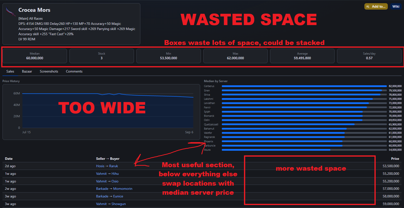
I'm with Maletaru. While the UI looks nicer, it's definitely a downgrade from a UX perspective. Information in the legacy UI is just presented in a much easier to read way.
If I'm looking for an item, why am I seeing a graph of other servers prices first, before I'm seeing the sale history on my own server?
There's just a lot more wasted space in general that I have to scroll through before I can see the information that is actually relevant.
By Genoxd 2026-09-07 23:06:44
B is way better on mobile. The pics you're showing look like the desktop layout
Carbuncle.Maletaru
Serveur: Carbuncle
Game: FFXI
Posts: 4559
By Carbuncle.Maletaru 2026-09-07 23:22:33
That's what I'm talking about, how does it take 3 page loads?
At the top middle is a search icon, I click it and type crocea. Auto populates into the list, I click the icon, takes me right to the page in the second Pic you have. Then scroll down
You can make a case for putting sales at top, but its one page away
Here are the pages I visit on my journey.
First
Second
Third
Fourth
I guess technically the third one might not be a different page load, but I presume it requires a connection to the internet to reach, because it's different from the second one.
..It also has different results if you type it in (or click it) compared to the results if you go to the search page and type the name in directly.
I am talking strictly about the desktop experience, I haven't tried it on mobile yet.
If you're on the "legacy" version of the site, it takes 2 page loads: you load the website (mandatory, obviously), then it loads the Crocea Mors page (with all the information right there for you to read). It's absolutely minimal, fast, and efficient.
We haven't even gotten into the other details, like how the legacy page shows the dates, but the new one shows "3 weeks ago"...so...way less useful?
By Genoxd 2026-09-07 23:26:08
Sure but it's stated as a mobile friendly feature "We've enabled a mobile friendly version of FFXIAH (works well on desktop too)"
Desktop is a bit clunky, but on mobile it seems much easier to navigate and view things
Carbuncle.Maletaru
Serveur: Carbuncle
Game: FFXI
Posts: 4559
By Carbuncle.Maletaru 2026-09-07 23:30:04
OK, looking at it on mobile the search is faster (or at least seems so), but it still has all the same problems. It takes about 3 scrolls (past a massive ad) to get to the sales data.
Picture of item (about half the page)
Median, stock, min, max, average, sales/day
Ad
Price history graph (*** useless)
Median by server
Begin of sales data.
Here's the legacy view:
Sword stats -> Sales data.
Some pictures of A and B again, this time on mobile:
A:

B:


By Genoxd 2026-09-07 23:40:43
Hold the phone vertical instead of horizontal?
Carbuncle.Maletaru
Serveur: Carbuncle
Game: FFXI
Posts: 4559
By Carbuncle.Maletaru 2026-09-07 23:51:24
OK, here ya go.
A (vertical):

B#2:


By Draylo 2026-09-08 00:02:00
Seems fine for me, I was talking about the mobile version earlier. While the placement of the information could use some shifting around, its direct and does what we need it to. Seems good for mobile instead of previously zooming in to hit the buttons for it.
[+]


 Carbuncle.Elvaanmoq Carbuncle.ElvaanmoqGuildwork Premium
Serveur: Carbuncle
Game: FFXI
Posts: 262
By Carbuncle.Elvaanmoq 2026-09-08 00:23:54
Thanks so much for continuing working on the site and improving it even after so many years, Scragg!
By Genoxd 2026-09-08 00:30:18
Yeah mobile seems way better, especially not having to zoom in and pan around. Also less fat fingering things
[+]
 Asura.Sechs Asura.Sechs
Serveur: Asura
Game: FFXI
Posts: 11549
By Asura.Sechs 2026-09-08 01:31:32
Thanks Scragg!
I like the feel of this new website, I've got nothing to say for the moment about the forum/discussions part, which is likely the part I use most on this website.
On mobile especially this feels way better.
I don't share the concerns Maletaru express but I've got some of my own.
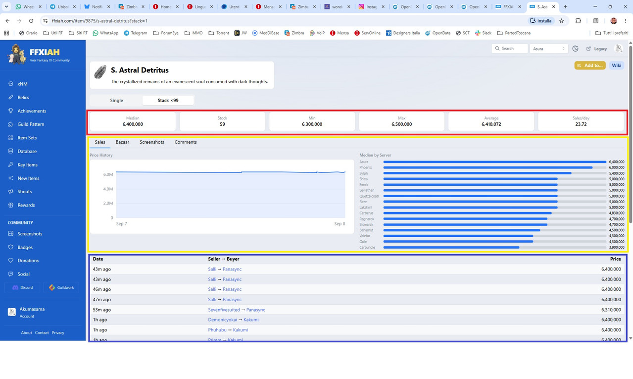
See the three colours?
From top to bottom atm it goes Red, Yellow and finally Blue.
In my opinion the order should be different.
Blue should be the very first "item" in the page order. Seeing the list of prices is imho the most important thing and hence should be placed as first on top.
Then I would put Red and finally Yellow.
I've got mixed feelings with the fact that bazaar, images and especially comments are now on different "tabs". With the old layout you see them all on the same page and I find that useful.
Altough that's probably a minor thing and it might be mostly a matter of getting used to it, I suppose. Let's give it some time and see how it feels for all of us one month from now.
But concerning the order thing I mentioned above, personally I think that's one thing that I would change right now.
My opinion is that, overall, this new layout optimizes things a lot for mobile devices/vertical layouts, but it feels like there's a bit of wasted space and opportunities for desktop setups with at least 1080p and even worse if you go higher.
Again I'm talking about the items browsing and related stuff, no concerns about the forum threads/discussions.
Altough I can say one small thing about the front page.
The old layout displayed 9 "last threads", the new one displays just 8.
I think you could reduce the size of the thread boxes a bit (they look very big in desktop setup after all) and allow for a display of the 10 last threads instead of the current 8.
Making them slightly more compact in the front page would also help reduce the feel of "wasted space" on desktop devices 1080p and higher.
[+]
By Scragg 2026-09-08 09:47:48
I appreciate the feedback from everybody. I made some adjustments, mostly to the item page on desktop. It should resemble the original.
- sales history at the top, on mobile it's closer to the top
- graph is only shown when the user is interested via an icon on price history
- tabs are gone, comments / screenshots are show below price history
- price calculations are condensed
- upload controls are on the screenshots widget
- added ffxidb link
- added min/max/partial as they exist in original
- removed the ad that came up over content, I do not permit intrusive ads
- the news widget on the front should not shift content
- sales rate label added (value on hover)
- forum images will have max width/height, expanded on click (same as og)
A note about finding the page you want fast, the unified search at the top is new. You can access via ctrl-k (or click) and just start typing, if the result you want is first, hit enter. If you think the results can be tweaked let me know! For example, if you type a item name and some forum post comes up or a username, that is wrong!
 Ragnarok.Ghishlain Ragnarok.Ghishlain
Serveur: Ragnarok
Game: FFXI
Posts: 1089
By Ragnarok.Ghishlain 2026-09-08 10:47:49
Is there a way to maintain blocked user posts from showing up at all, like it does for OG desktop version?
I prefer no indication the user is posting versus being told by the mobile site that the user is blocked. See screen cap below for reference

With that being said, a cursory look at the site via mobile device seems really nice, will poke if I see anything to report.
By Shichishito 2026-09-08 11:03:01
I noticed since the site update embedded youtube videos quickly blink like 5-10 times after you refresh the site. Only seems to be the case on the old layout, not the new one.
Serveur: Asura
Game: FFXI
Posts: 212
By Asura.Reidden 2026-09-08 11:37:42
I just tried the desktop version. When I clicked on a recipe, it loaded the amount of materials I needed more than one of all the way to the end of the screen on the right. Kind of like this:
Cermet Chunk x3
Edit: I thought it would let me replicate it by pushing the x3 with the spacebar lol. Just make believe the x3 is all the way to the right of the screen.
By Genoxd 2026-09-08 13:42:56
Oh item pages look even better on mobile now. My one nit would be the search. Keeping players/forum search separate from item search. Often I only remember part of the items name then just auto complete it from the list but with users included sometimes the users show up first.
If you want to keep it the same search, maybe prioritize items before users/forum topics?
[+]
Serveur: Asura
Game: FFXI
Posts: 298
By Asura.Sensarity 2026-09-08 14:10:33
New item page looks great, thanks Scragg.
[+]

Asura.Saevel
Serveur: Asura
Game: FFXI
Posts: 10538
By Asura.Saevel 2026-09-08 16:05:56
NewUI was good on mobile, hideous on desktop. Staying with legacy for now. Desktops have a lot more screen space for organizing relevant information and do not need spammed with giant "LOOK HERE" tiles for people missing their ADHD medicine.
Legacy site is well laid out for information in an easy to find categorized way. No need to throw "what's new" FOMO at people randomly with flat minimalist design that pervades everything today.
 Asura.Eiryl Asura.Eiryl
Serveur: Asura
Game: FFXI
By Asura.Eiryl 2026-09-08 18:17:05
Sometimes when using the normal UI it kinda hybrids into the new UI
Blank spaces etc, i'll SS it next time
 
Bahamut.Navius
Serveur: Bahamut
Game: FFXI
Posts: 156
By Bahamut.Navius 2026-09-08 19:24:20
Overall, I'm liking much of the new design, especially with the recent updates to the item pages. A few things:
1) For the rotating news on the homepage, can we have an indicator for which news story is being displayed, like was present in the old UI? Right now, jumping to the most recent news story isn't very intuitive.
2) Maybe I'm looking in the wrong spot, but I can't find where to access/edit my nodes. Is there a link somewhere I'm not seeing?
3) I suspect this may be controversial, but can we have a link to the FFXIclopedia wiki as well as BG Wiki and FFXIDB, like on the old UI? I understand that BG is regarded as the 'premier' wiki, but having access to both on the item pages was useful.
Thanks!
We've enabled a mobile friendly version of FFXIAH (works well on desktop too). It can be accessed via the new UI button on the side nav.
You can switch back using a button on the top right of the new UI. The classic FFXIAH design will be supported indefinitely.
The new UI should have most of the capabilities of the original, let me know if it's missing something.
Credit goes to Otak of Fenrir for the image, she also designed my avatar (I need a new one with grey hair). https://www.deviantart.com/lurazeda
If you would like to have your fan art showcased at the top for holidays or events, let me know. I will try to make it happen.
Mobile — Light Mode
|
Mobile — Dark Mode
|
Tablet — Light Mode
|
Tablet — Dark Mode
|
Desktop — Light Mode
|
Desktop — Dark Mode
|
|
|